

This is the paint in the master -- note that the two walls are actually different shades of red-burgundy! Boys' room is actually a bit deeper blue-green than this picture shows, but the team banners sure look like they were made to go in this room. (BTW, we're NOT Dodger fans; it is from the game they went to against the Rockies).
 Here's the girls' room -- StringBean's "Cinderella" print looks great on these darker blue walls!
 Here's the upstairs bath, with its pale lilac walls and purple stencilling. The tile and all fixtures are white.
 The bath downstairs is a rusty orange tone -- and note that the ceiling is the same color. The tile and all fixtures are white. This is the only room we haven't found something to hang up -- the color is a bit odd.
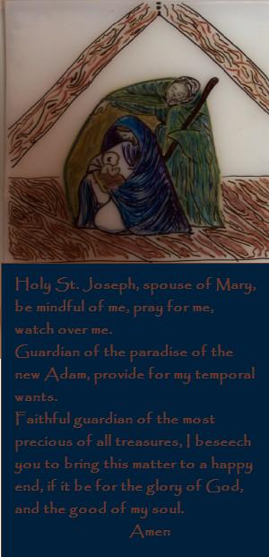
The living room is a green that is somewhere between the two green panels on the knitted wall-hanging (the camera had a hard time picking up the shade of green). But if you'll notice the wall-hanging and the Guadalupe print are complementary shades of green. This is the dining room. My camera just can't get the color right -- a cross between mustard yellow and brownish gold. But our icons look great on this wall! Burgundy goes well with this color too, so our table runner and candles are burgundy.
So, there you have it -- color that seems odd, but works!


 ...
... 


1 comment:
I like the colors - about the rusty orange...my sister gave me towels this Christmas the same color - not MY style...but the girls like them so I figured maybe we'll just use 'em at the pool!
Post a Comment